 Share
Copy Url
Share
Copy Url
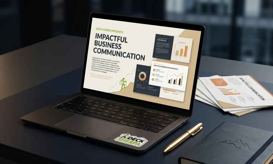
We have all sat through a presentation and thought, "This could have been an email." But here is the thing, the problem is almost never the content. It is the PowerPoint presentation slides. When slides are poorly designed, even a great idea gets lost. When they are well-crafted, they do something powerful. They make complex information easy to absorb, and they keep the audience hooked from the very first screen.
Think about the last business presentation that truly impressed you. Chances are, it had a clean layout, a cohesive style, and engaging visuals that made every point land. The presenter looked confident, the story flowed naturally, and the data was easy to follow. That is not luck. That is the result of intentional slide design.
Today, Microsoft PowerPoint remains one of the most widely used tools to create a presentation. And with features like Copilot in PowerPoint, AI-assisted design, and real-time collaboration, building impactful decks has become more accessible than ever. Yet, many presentations still fall flat because the design, structure, and storytelling are not given the attention they deserve.
This article walks you through everything that makes PowerPoint presentation slides truly work. From structure and visual design to audience engagement and knowing when to bring in expert help — you will walk away with a clear picture of what it takes to create a professional presentation that leaves a lasting impression.

Before the presenter says a single word, the slides are already doing the talking. A well-designed deck shapes how an audience feels about the message, the presenter, and even the brand behind it. Good slides don't just look nice. They build trust and make ideas easier to absorb.
Effective PowerPoint presentation slides are clear, focused, and easy to follow. They use a clean layout, readable text, and relevant visuals to guide the audience through the content. Each slide carries one clear point and supports the presenter without pulling attention away from them. When that balance is right, the whole presentation feels natural and polished.
Presentation slides are used across nearly every professional setting. You will find them in sales decks, investor pitches, team updates, training sessions, and client meetings. In each case, the goal stays the same. The slides help the speaker communicate more clearly. They do not replace the speaker. They work alongside them.
Research shows that audiences form an impression within seconds of seeing a slide. A clean, professional presentation design signals credibility right away. On the other hand, a cluttered slide with tiny font size and too many bullet points can make even a strong message feel weak.
When a topic is dense or data-heavy, visuals do a lot of the heavy lifting. Charts and graphs turn raw numbers into stories. Infographics break down multi-step processes into something the audience can actually follow. People retain visual information far better than text alone, which is why slide design plays such a direct role in how well an audience remembers the key takeaways.
Poor visuals, low-quality graphics, and slides packed with too much text all send the wrong signal. They make a presentation harder to follow and the presenter harder to trust. A professionally designed deck, on the other hand, keeps the audience engaged and helps the message land with more impact.
A great deck is not just a set of slides. It is a journey. Every slide should feel like the natural next step from the one before it. When structure is right, the audience follows along without effort. When it is not, even strong content gets lost.
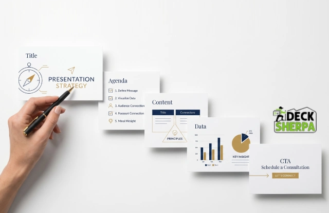
A well-structured presentation moves in a clear direction. It opens with context, builds through key points, backs them up with proof, and closes with a clear action. The layout of your PowerPoint presentation slides shapes how ideas land and how much the audience takes away.
The flow works like this:
Title slide - Sets the tone. Introduces the topic, the presenter, and the purpose at a glance.
Agenda or context slide - Tells the audience what to expect. It creates a roadmap before the detail begins.
Key content slides - Deliver the main points, one idea at a time.
Proof or data slides - Back up the key points with evidence, numbers, or case studies.
Closing or CTA slide - Ends with a clear next step. This is where the audience knows what to do next.
Different presentations need different slide types. Here are the ones that matter most in a business context:
Title slide - Opens the deck. Includes the topic, speaker name, and logo.
Problem slide - States the challenge the audience or the market faces.
Solution slide - Shows how that challenge gets addressed.
Market slide - Outlines the opportunity and who it is for.
Traction slide - Shares real numbers, milestones, or growth to build credibility.
Team slide - Introduces the people behind the work.
Call-to-action slide - Closes the deck with a clear and direct next step.
Not every deck needs all of these. A training deck will look different from an investor pitch. The key is to choose the right set of slides for the purpose and arrange them so they tell a complete story.
One of the most common slide design mistakes is trying to cover too much on a single screen. When a slide mixes data, long text, multiple graphs, and three separate points, the audience gets confused. They stop listening and start reading.
The fix is simple. Each slide should carry one clear idea. The title states it. The content on the slide supports it. Everything else belongs on the next slide or in the speaker notes. This approach keeps the audience focused and makes the presentation far easier to follow. It also gives the presenter more control over the room.
Structure and storytelling go hand in hand. A smooth narrative moves the audience from context to insight to action. It does not just list information. It connects the dots.
Think of it this way. The first few slides set the scene. The middle slides deepen the message with evidence and examples. The final slides bring everything together and point the audience toward a clear outcome. When each slide leads naturally into the next, the whole deck feels cohesive. The audience does not need to work hard to follow along. They simply do.
This kind of flow does not happen by accident. It takes deliberate planning, a clear goal for each slide, and an honest look at whether the deck tells a story or just dumps content onto a screen.
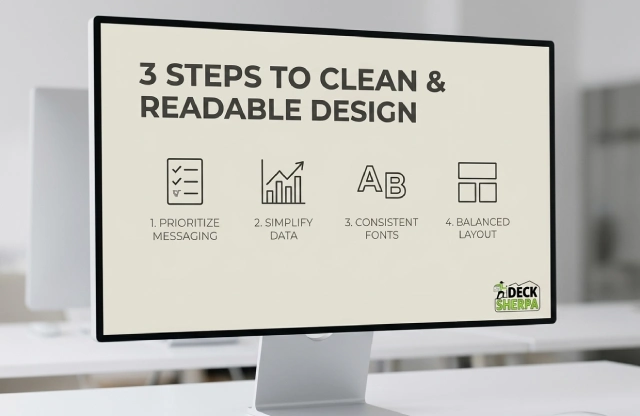
Good design is not about making things look fancy. It is about making things easy to understand. A clean slide keeps the audience focused on the message, not on the clutter around it. When design gets out of the way, the content gets to shine.
Readability always comes first. A slide that looks beautiful but is hard to read is not doing its job. Strong contrast between text and background makes a big difference. Dark text on a light background, or light text on a dark background, helps the audience read without squinting. A sensible font size and clear, simple fonts make the content feel instantly approachable. When you keep the layout tidy and the spacing generous, even a dense topic feels easier to follow.
Layout matters just as much as content. Aligned elements, consistent spacing, and enough breathing room between sections give each slide a calm, organized feel. Too many elements competing for space make the whole presentation harder to follow. The goal is a set of slides that feels effortless to look at, not stressful.
Quality visuals also play a big role. Relevant images, clean icons, and well-placed graphics support the message without pulling attention away from it. Visuals added purely for decoration tend to distract more than they help. Every graphic on a PowerPoint presentation slide should earn its place by adding meaning or clarity to the content around it.
Long paragraphs on a slide are rarely a good idea. By the time the audience finishes reading, the presenter has moved on. Short phrases work far better. They are faster to read and easier to remember.
Wherever it makes sense, swap blocks of text for something visual. An icon can represent an idea in an instant. A simple diagram can explain a process that would otherwise need three bullet points. An infographic can turn a complex set of steps into something the audience can scan in seconds. The key is to use these tools with purpose, not just to fill space.
The fonts and colors across a presentation are not just style choices. They are part of the brand. When the same font style, color palette, and spacing appear consistently from slide to slide, the deck looks professionally designed and cohesive. It also makes it easier for the audience to follow, because the visual language stays familiar throughout.
A good rule of thumb is to stick to one or two font types across the full deck. The font size should be large enough to read from the back of the room. Body text typically works well between 18 and 24 points, while headings benefit from a larger size that creates a clear visual hierarchy. Color choices should complement each other and support the brand, not distract from the message.
Data slides can easily become overwhelming. A chart packed with too many numbers, categories, and colors forces the audience to work hard just to understand what they are looking at. The better approach is to show only the data that supports the point being made. Everything else can live in the appendix or the speaker notes.
Clean labels, simple color coding, and one clear takeaway per chart make data visualization tools far more effective. When a graph or chart is easy to scan, the audience picks up the insight quickly and stays with the presenter. That is exactly what a well-designed data slide should do.

Information alone does not hold an audience. Connection does. When a presentation combines a clear story with the right visuals and a pace that feels natural, people stay engaged from the first slide to the last. Good design helps, but story is what makes it memorable.
A well-built deck gives the audience a path to follow. It starts with a clear context, builds through key points, and moves toward a resolution. That is what storytelling in presentations really means. It is not about drama. It is about direction. When each slide leads naturally to the next, the audience never has to wonder where the presentation is heading. They stay with the speaker and absorb the message more easily.
Visual emphasis plays a big role in keeping people focused. A strong headline grabs attention. Supporting proof builds credibility. And relevant visuals help the message land without words doing all the work. Together, these elements make PowerPoint presentation slides feel purposeful and engaging rather than flat and forgettable.
Animation and transitions can support that engagement, but only when used with restraint. A smooth transition helps the eye move from one idea to the next. It signals progress without interrupting the flow. However, excessive animation pulls focus away from the content. When slides spin, bounce, or flash, the audience starts watching the effects instead of listening to the presenter. Simple and subtle always wins.
Not every deck works for every room. A training deck for new employees needs a different tone and depth than an investor pitch. A sales deck needs to speak directly to business pain points and outcomes. An internal team update can afford to be more conversational.
Getting this right means thinking about what the audience already knows, what they care about, and what they need to walk away with. An investor wants to see traction, market size, and a credible team. A client wants to see how the solution fits their problem. A learner needs clarity, repetition, and examples they can relate to. When the slides are built for the right audience, the message lands faster and the presenter looks far more prepared.
Data on its own rarely moves people. What moves people is understanding what the data means for them. Linking numbers to real outcomes, customer stories, or business challenges gives facts a purpose. It also makes them far easier to remember.
For example, a revenue growth figure becomes more powerful when it is connected to a specific product decision. A customer satisfaction score lands differently when it is paired with a real story about how a problem was solved. This approach turns information into insight. It also gives the presenter something to say beyond simply reading the slide. Case studies, short testimonials, and concrete before-and-after comparisons all work well here. They add texture and make the presentation feel grounded in real experience.
Even well-intentioned decks can lose an audience if a few key mistakes creep in. Here are the ones that come up most often:
Overloading slides with text. When a slide is packed with paragraphs, the audience reads instead of listens. By the time they finish, the presenter has moved on. Concise, focused content always works better.
Using too many animations. A presentation that relies on flashy effects quickly feels amateur. Transitions should guide the eye, not perform for it.
Shrinking the font size to fit more content. Small text forces the audience to squint. If the content does not fit comfortably on one slide, it belongs on two.
Ignoring the audience entirely. Slides that are built without a clear sense of who is in the room tend to feel generic. Tailoring the depth, tone, and examples to the specific audience makes a measurable difference.
Skipping speaker notes. When presenter notes are left blank, the presenter ends up relying on the slides entirely. Notes help maintain flow and keep the delivery confident without reading directly off the screen.

Sometimes a DIY deck gets the job done. But for high-stakes moments, such as investor pitches, client proposals, or major sales presentations, the quality of your slides can directly affect the outcome. That is when expert help stops being a luxury and starts being a smart business decision.
Many professionals hit the same wall. There is not enough time to build a polished deck from scratch. The branding feels off. The charts do not read clearly. The slides look fine but somehow fail to persuade. These are common pain points, and they tend to show up right before a deadline. A lack of design skills does not mean the content is weak. It just means the presentation is not doing that content justice.
That is exactly where professional presentation designers make a difference. They bring strategic structure to the content. They clean up the visuals, sharpen the story, and make sure every PowerPoint presentation slide feels intentional and cohesive. The result is a deck that communicates with clarity and leaves the audience with a strong, lasting impression.
A specialist agency also frees up your time. Instead of spending hours wrestling with layouts and templates, you can focus on the content, the message, and the delivery. That is a far better use of energy before any important presentation.
It is not always obvious when a deck needs professional attention. Here are a few signals worth paying attention to:
Missed deadlines. If building the presentation keeps getting pushed back because it takes too long, that is a clear sign the process needs support.
Cluttered slides. When slides feel busy, hard to read, or visually inconsistent, they are working against the message rather than supporting it.
Weak visual hierarchy. If the audience does not know where to look first on a slide, the design is not doing its job.
Decks that fail to convert. A pitch that looks good but does not win the room often has a structural or storytelling problem, not a content problem.
Inconsistent branding. When fonts, colors, and graphic styles change from slide to slide, the deck starts to feel unpolished, and that affects trust.
A good presentation design service covers far more than making slides look attractive. Here is what you can typically expect:
Custom slide design built around your brand, your content, and your audience
Professionally designed templates that are editable and reusable for future decks
Storytelling support to help structure the content in a way that flows and persuades
Chart and data clean-up so graphs are easy to read and the right numbers are highlighted
Brand consistency applied across every slide, from fonts and colors to logo placement
Review rounds to refine the deck based on feedback before it goes in front of an audience
These services work across business presentations of all kinds, from corporate slide shows and sales decks to pitch decks and training materials. The goal is always the same. Turn raw content into something high-quality, clear, and genuinely impactful.
Deck Sherpa is a presentation-only design studio with a sharp focus on clean, elegant, and persuasive slide design. The team specializes in transforming complex content into professionally designed decks that look polished and communicate with purpose.
Whether you need a pitch deck built from scratch, an existing presentation redesigned, or a set of customizable templates your team can use going forward, Deck Sherpa handles all of it. The studio has worked across industries and use cases, from investor decks and sales presentations to corporate communications and RFP responses.
You can browse real work on the Deck Sherpa showcase to get a feel for the quality and range of output. If you are ready to start a project, the team is easy to reach by phone or WhatsApp, and the process is straightforward from brief to delivery.
For anyone who wants to save time, elevate their brand, and walk into a room with a deck they feel confident about, Deck Sherpa is well worth a conversation.

Great PowerPoint presentation slides do not happen by accident. They take clear thinking, smart structure, and intentional design. When all of that comes together, the result is a deck that holds attention, earns trust, and moves people toward action.
Every section of a strong presentation plays a role. Structure keeps the story on track. Clean, readable slide design makes the content easy to absorb. Storytelling connects the facts to something meaningful. And the right visuals help ideas land faster than words alone ever could. When these elements work together seamlessly, a presentation stops feeling like a slideshow and starts feeling like a conversation.
That is a high bar to clear on your own, especially when deadlines are tight and the stakes are high. Sometimes the smartest move is to bring in a team that does this every day.
Deck Sherpa is India's leading presentation design agency, with over two decades of experience helping businesses create professional, high-quality decks that captivate audiences and deliver results. From investor pitches and sales decks to corporate presentations and custom templates, the team handles it all with elegance and precision.
Take a look at the Deck Sherpa Showcase to see the work firsthand. Visit the Services page for a full picture of what is on offer. Ready to start? Call 1800 121 5955, email contact@decksherpa.com, reach out via WhatsApp, or fill in the Contact Form on the website. The team is ready to help you put your best slide forward.
Share
Copy Url
Share
Copy Url
Share
Copy Url