 Share
Copy Url
Share
Copy Url
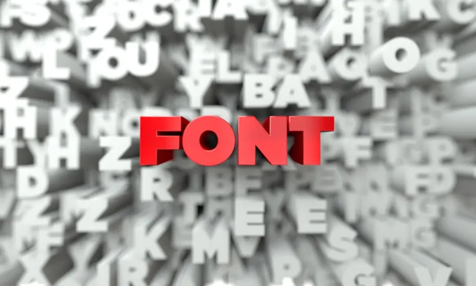
Welcome to our guide on heading fonts. In today’s fast-paced world, your slides must stand out to capture your audience. Selecting professional fonts for your titles is crucial, whether you’re using PowerPoint or showcasing a modern slide deck. With so many fonts for headings available, it can be tricky to pick the right typeface. Effective typography design is more than a style choice—it’s about holding the reader’s attention with eye-catching text. You can test different fonts and see what best fits your topic and audience, but good font choices often lead to a bolder, cleaner look.
In this article, we will discuss why choosing the right heading font matters, the top 10 heading fonts to captivate your audience, and how to unlock powerful presentations with Deck Sherpa. Each section will guide you on how to make the most of your headings. You’ll learn how professional design meets clarity and purpose. By the end, you’ll see how small details in your headings can transform your entire presentation. Plus, we’ll reveal how to add subtle style tweaks that enhance every slide. This approach ensures that your headings shine on any platform.
Our expert tips will simplify your quest for the best heading fonts. Get ready to give your slides the boost they need!
In presentation design, the right heading fonts can transform your slides by drawing attention and setting the tone. Such fonts shape how your viewers connect with your message. In this section, we’ll explore their crucial role and see how they can elevate your entire slide deck.
Your heading is often the first thing viewers notice on PowerPoint slides. A bold typeface draws eyes right away and lets you use headlines to create intrigue. This immediate impact can shape how people experience your entire presentation. By establishing a clear hierarchy, you guide their focus from the start.
Choosing a stylish heading font sets the mood for your entire slide deck. Whether you aim for a warm, playful vibe or a sleek, professional look, the right letters help you create an immediate impression. When text and headings feel balanced, your message stays legible while showing your audience what to expect next.
Clear heading fonts are crucial when your slides contain important details. They make each word easier to absorb and work well alongside storytelling in presentations. When text elements serve a purpose instead of just filling space, viewers stay focused on what truly matters. This clarity helps them process your message faster and with less strain.
Your choice of heading fonts can reveal your brand’s character. Working with PowerPoint specialists helps you select professional fonts for presentations that align with your style and goals. By staying true to your company’s voice, you show consistency that encourages trust. From color to letter shape, each detail speaks volumes about who you are.
Selecting the right heading fonts can change how your slides look. Each option offers distinct features that elevate your message. In this list, we explore ten choices. Each is suited for different goals and styles, making it easy to craft visuals and keep the audience interested.
Montserrat is among the most popular typefaces for engaging presentations. Its clean curves and balanced proportions project a modern feel that suits heading fonts perfectly. This versatile option stays bold without overpowering other elements. It draws attention to titles while remaining simple enough to blend seamlessly with varied slide designs.
Bebas Neue showcases a striking uppercase form that can help you create a strong first impression. It encourages clear hierarchy by distinguishing headings from smaller text elements. The letters are tall and spaced, adding a commanding presence on each slide. This look works well for high-impact statements or key points.
Oswald is known for its unique style, featuring narrow letters that remain legible even in tight layouts. Its tall form factor frees up space on slides packed with visuals. This font helps keep your titles clear while letting you add more content around them. It delivers sophistication without feeling overcrowded.
Avenir blends geometric shapes with a crisp finish, making text and headings appear stylish. Its balanced spacing keeps your slides tidy, even if you rely on AI in presentation design to optimize layouts. This refined choice suits modern themes, pairing well with colorful visuals or backgrounds highlighting content.
Roboto Condensed features straight lines and compact letters, making it simple to read in any presentation layout. Its versatile design supports clear heading fonts while accommodating smaller text. This streamlined look pairs well with graphics, helping you adopt a sustainable presentation design that reduces visual clutter and maximizes clarity.
Lato stands out among popular typefaces by offering a smooth appearance that feels both friendly and professional. Its moderate thickness helps each letter stay clear on screen, letting you find the right font balance for titles and content. It supports various weights, so you can emphasize headings without overwhelming viewers.
Poppins features rounded edges and a sleek, serif-free structure that feels appealing and engaging. This modern look maintains readability and suits both large titles and smaller text blocks. Its balanced spacing allows you to highlight information effectively. When paired with subtle visuals, it showcases a very welcoming style for viewers.
Open Sans Extra Bold is a thicker sans-serif variation that stands out on any slide. Its weight ensures titles grab attention and emphasize key details. This font style adds impact without sacrificing clarity, letting you make critical points clear. Pair it with simpler text elements to maintain harmony across slides.
Playfair Display delivers a polished, classic look influenced by old-fashioned printing methods. Its delicate curves provide a graceful presence without feeling outdated. Each stroke appears refined and charming, making it great for slides needing a timeless touch. Use it for titles when you want an elegant, enduring impression.
Gotham Bold exudes urban confidence and is ideal for brands with a modern mindset. Its blocky, even lettering stands out against both busy and minimal backgrounds. The bold weight grabs attention while still feeling purposeful. Opt for this font if you want your headings to emphasize a strong, contemporary, and impactful attitude.
If you'd like more information on the different types of fonts to use in presentations, check out the following articles.
20 of the Best Fonts for PowerPoint Presentations
Introducing Professional Fonts for Presentations

Deck Sherpa is a professional service dedicated to building compelling slides that align with each client’s brand. They specialize in designing engaging presentations that help you make the best impact. Their team manages every detail, from layout to visual flow, so you can communicate clearly in any setting.
Deck Sherpa’s experts bring years of knowledge to every project. They evaluate your goals, brand personality, and overall style before suggesting the perfect heading fonts. By leveraging AI in presentation design, they ensure your slides adapt to any environment. This approach simplifies decisions and sets you on the right path.
From color schemes to layout structure, Deck Sherpa’s presentation designers craft slides tailored to your message. Clear visuals and measured spacing guide your audience. Each presentation gets a personal touch that showcases your unique brand’s story. This way, you confidently share details and maintain consistency across all communication platforms.
Instead of handling each design aspect yourself, rely on Deck Sherpa’s team for quick, high-quality results. Outsourcing presentation design to them means you focus on delivering content without worrying over visuals. This efficient process frees you to rehearse, refine your speech, or manage other projects in your busy schedule.
Deck Sherpa produces heading fonts and visuals that wow any audience. By embracing sustainable presentation design techniques, they keep materials fresh and eco-friendly. Their designs bring clarity, leaving a strong impact on viewers. Well-structured slides stand above the competition. Each pitch gains momentum, reinforcing your ideas with confidence and professionalism.

Working with experts who prioritize flawless design can give your presentations the professional edge they need. Polished slides showcase a clear message and help close deals, secure funding, and impress potential clients. In the long run, well-structured presentations become a powerful asset for continuous business growth.
At Deck Sherpa, we make the entire process smooth and hassle-free. Our team delivers visually striking slides, helping you stand out in every pitch. This convenience and speedy turnaround free you to focus on content, strategy, and winning over your audience. For a closer look at our work, check out our Showcase. You can also visit our Services page for a full overview of what we do.
Ready to transform your slides? Call us at 1800 121 5955 (India) or email contact@decksherpa.com for a custom quote or consultation. We’re happy to chat via WhatsApp or the Contact form on our website. Let Deck Sherpa’s expertise and dedication guide you to presentations that leave a lasting impression.
Share
Copy Url
Share
Copy Url
Share
Copy Url