 Share
Copy Url
Share
Copy Url
Typography in presentation design is more than beautifying words; it's crucial for effective communication. Choosing the best typography for presentations helps enhance your slides. The right typeface choices turn simple slides into engaging visual stories. Whether you are crafting a PowerPoint presentation or enhancing your presentation design, the fonts you pick are vital. They greatly impact how people perceive your message.
But how does typography enhance a presentation? It's about how typography plays with other elements on your slide. It guides the viewer’s attention and highlights your main points. In this article, we will explore how careful font selection and usage can make your presentations more engaging and memorable. We will cover everything from basic tips on choosing the right fonts to advanced techniques in typography for presentations. By the end, you'll know how to create visually appealing and impactful slides.

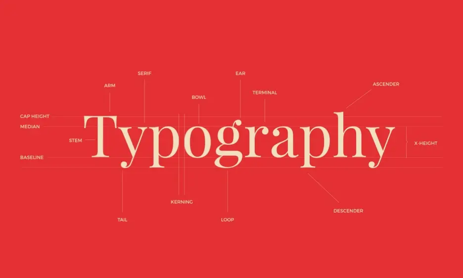
Typography is both an art and a technique for arranging type. This makes written language clear, readable, and visually appealing. The process involves choosing typefaces, setting point sizes, and managing line lengths. It also includes adjusting line spacing, known as leading, and letter spacing, known as tracking. Even the space between pairs of letters, called kerning, is fine-tuned. Typography also refers to the style, arrangement, and appearance of letters, numbers, and symbols created through this process. It's crucial in designing user interfaces, enhancing both the look and usability of text.
Typeface choice can evoke different emotions and associations. This makes typography a key tool in visual communication and graphic design. It's widely used across all design types, from print media like books and magazines to digital platforms such as websites and mobile apps. Effective use of typography helps designers communicate messages clearly and makes information both accessible and engaging.

Typography in presentation design greatly improves your slides' impact, whether you're using PowerPoint, Google Slides, or other tools. Let's look at different fonts and how they enhance presentations:
Serif fonts have small lines or strokes at the end of their main strokes. Examples include Times New Roman and Garamond. These fonts are viewed as formal and classic. They are perfect for professional or traditional presentations. They lend a sense of reliability and respectability to your presentation design and work well in printed formats.
Fonts like Arial and Helvetica are sans-serif, meaning they don't have the small lines at the end of strokes. These fonts are popular in modern presentation design because of their clean and simple look. They are easier to read on digital displays. Sans-serif fonts give your PowerPoint presentations a modern feel and convey clarity and simplicity.
Use display or decorative fonts for big headings or to grab attention. They add personality and make slides interesting. However, use these fonts sparingly in your presentation design. Too much can overwhelm your audience and reduce readability. When used wisely, they highlight key areas and engage your audience effectively.
Knowing the roles and effects of different font types is key in presentation design. It’s not just about making slides look good. It’s about improving communication and making sure your main points are clear. Always consider how your font choices affect your presentation’s effectiveness. Experiment with different fonts to best express your message and keep your audience interested.
Choosing the right fonts for your presentation is crucial for effective communication and design harmony. Here’s a closer look at how to select appropriate fonts for different parts of your presentation:
For titles in your presentation, pick fonts that stand out and grab attention. These fonts should be bold and distinctive to set the tone right from the beginning. They play a vital role in typography for presentation design by captivating the audience early on. Consider using decorative or display fonts for your titles, but make sure they are clear even from a distance.
Headings organize the content and guide your audience through the presentation. Choose fonts for headings that are clear and bold enough to create a hierarchy on your slides. This makes it easier to distinguish headings from body text and subheadings, simplifying navigation through the slide. Depending on your presentation’s style and tone, both serif and sans-serif fonts can work well. Make sure these fonts complement the title fonts and enhance the overall design without dominating it.
The body text delivers the main message of your presentation, so it must be easy to read. Select simple and legible fonts for body text, especially at smaller sizes. Body fonts should not clash with the stylized fonts used for titles or headings. Sans-serif fonts are often chosen for body text in digital presentations like PowerPoint and Google Slides because they are more readable on screens. Ensure the body text not only is readable but also harmonizes with the other typography in your presentation.
Choosing the right fonts means considering their types, roles in the content hierarchy, and visual impact. Typography in presentation design is crucial for effective communication. Always strive for a balance between style and functionality to ensure your main points are clear and engaging. The aim is to improve the audience's experience and deliver your message effectively.
When crafting captivating presentations, the proper use of typography is essential. Here are some strategies to effectively use fonts in your presentation design:
Choose the easy-to-read type of font for your body text to ensure clarity and legibility. This is crucial as complicated fonts can distract and make content hard to read.
Opt for sans serif fonts like Arial or Helvetica for body text, as they are generally more legible, especially on digital screens. This helps in conveying your message and ensures that your presentation is accessible to everyone in the audience.
Use high contrast between text color and background to enhance readability. For example, dark text on a light background or vice versa can make your slides easier to read from a distance.
Employing various font sizes helps establish a visual hierarchy, making it easier for your audience to navigate through the content and understand what's most important.
You can emphasize certain parts of your text by changing the weight—bold for key points can draw attention effectively.
Proper spacing between lines (leading) and between words helps improve the readability and appearance of your slides. Remember, good kerning (spacing between characters) prevents the text from looking uneven.
While colors can make your presentation attractive, it's important to use them wisely. Stick to a color palette that matches your presentation's theme. Use colors that contrast well with the background for text to ensure legibility.
Ensure there is enough contrast between your font colors and the background to maintain legibility from any distance.
Consistency in your font choices across the entire presentation helps maintain a cohesive look and reinforces your message.
While center alignment can be visually appealing for titles or headers, use it sparingly for body text as it can be harder to read.
Avoid justifying text as it can create irregular spacing between words, making it difficult to read.
For titles and headers, consider using display fonts to add style and attention-grabbing elements to your slides. However, ensure they remain legible and appropriate for your presentation's tone.
Integrating text with images or graphics can make your slides more engaging and memorable. Only ensure the text stands out enough to be readable.
Typography in presentation design is crucial for both enhancing the visual appeal of your slides and improving their functionality. It ensures that your main points are communicated. Always strive for a balance between style, readability, and consistency. This will make your presentations both engaging and effective.

In today’s digital age, the impact of typography in presentation design cannot be overstated. From enhancing readability to expressing emotions, the choice of fonts and their arrangement play a pivotal role in how your message is received. Here, we explore the multifaceted benefits of employing effective typography to create more impactful and engaging presentations.
Typography in presentation design holds a crucial role in ensuring the text is easy to read and understand. Proper typography enables the audience to quickly grasp the message, enhancing the effectiveness of the presentation. This is vital because clear and legible text helps convey information efficiently.
Typography can help evoke certain emotions, setting the tone right from the start of your presentation. By selecting appropriate fonts and styles, you can express various moods—whether serious, light-hearted, or sophisticated. This not only engages the audience but also makes the experience memorable.
Effective use of typography in presentation design creates a visual hierarchy, clarifying the structure of information. You can establish this hierarchy by varying the font sizes, styles, and colors. In turn, it also helps differentiate headings, subheadings, and body text. Such organization guides the audience through the presentation smoothly.
Maintaining a consistent typography aligns with your brand identity, making your presentations instantly recognizable. Adhering to your brand's typography standards—such as typeface, font size, and color schemes—strengthens brand presence and builds trust with the audience.
Typography enhances the aesthetic quality of a presentation. Well-chosen fonts and thoughtful typography improve the design, making the presentation visually appealing. This not only captivates the audience but also boosts the perceived quality of the content.
Typography plays a vital role in making presentations accessible to all, including those with visual impairments or learning disabilities. Properly chosen fonts, sizes, and spacing ensure that presentations are legible for everyone, thus broadening your audience engagement.
Professional typography enhances the credibility of your presentation. A well-structured layout with appropriate fonts reflects the presenter's expertise and meticulousness, boosting the audience's confidence in the content.
Using consistent typography throughout the presentation aids in coherence and ease of understanding. Uniform font choices, sizes, and colors across slides make the presentation appear more polished and professional.
Strategic typography captures and directs the audience's attention to key information. Emphasizing important points through bold or colored text ensures that the audience focuses on what matters most.
Creative and visually appealing typography makes your presentation more memorable. Unique and attractive text presentation can leave a lasting impression, increasing the likelihood that the audience will recall the information later.
Presentation designers must grasp and apply typography principles effectively to send powerful messages. By emphasizing readability, emotional impact, and visual appeal, designers can make sure their presentations not only grab attention but also make a memorable impact. These strategies highlight typography's key role in presentation design, showing it as a vital tool for any effective communicator.

Understanding and employing effective typography in presentation design is more than an artistic choice—it's a strategic one that enhances communication and impact. At Deck Sherpa, the premier presentation design agency in India, we master this art by staying updated with the latest presentation design trends, including the nuanced use of typography. Our expertise allows us to create presentations that are not only visually appealing but also highly effective, whether they are sales presentations, investor pitch decks, or other forms of corporate communication. To see examples of our work that illustrate our approach to typography in presentation design, visit our Showcase page. For a deeper understanding of our services, check out the Services pages on our website.
Ready to elevate your presentation game? Fill in our contact form, WhatsApp us directly, or call us at 1800 121 5955 (India). You can also email us at contact@decksherpa.com with your specific requirements. Let's make your next presentation unforgettable!
Share
Copy Url
Share
Copy Url
Share
Copy Url