 Share
Copy Url
Share
Copy Url
Whether you're new or experienced in making slides, it's important to learn how to make a great presentation. You must keep your audience interested and listening.
In this guide, we're going to dive into everything about making great presentations. You'll get to know what presentation design is all about, and we'll show you how it's both an art and a bit like science too.
This article is like your go-to guide for all things about designing presentations. We'll explain different presentation styles, offer simple slide tips, and share the newest design ideas.
Presentation design is always changing and growing. This means that there's a lot of important information you need to know. By the time you're done reading, you'll have all the tricks up your sleeve to create presentations that look amazing and get your point across.
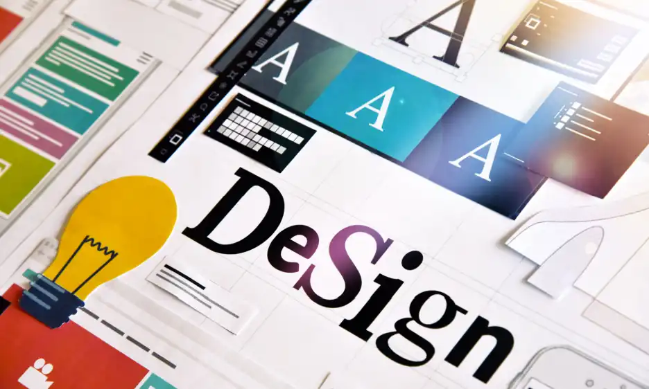
Presentation design is about making slides with pictures, words, and colors that help share your ideas.
You pick just the right mix of these things to make slides that teach people and look great. A good presentation provides a clear message while keeping people interested from start to finish.
A skilled presentation designer is integral to this process. They work to understand the core message and the target audience to create a cohesive set of slides. There are special design principles put in place to organize information so it's easy to understand and make an impact. A presentation designer's job is two-fold. He or she must simplify information and make it interesting in a presentation.
In a world where attention spans are short, effective presentation design is crucial. It's not only about aesthetics; it's a critical tool for communication. Presentation designers turn your spoken ideas into compelling graphical stories. This way, they make sure your presentation connects with people and sticks in their minds.
Yes, presentation design is essential for several reasons:
Presentation design organises your thoughts and data visually, preventing confusion. It helps you simplify information into digestible pieces, ensures that your main points are easy to grasp, helping your audience understand your message quickly and accurately. This is especially helpful when you sit through business presentations or even financial presentations.
Engaging presentation design goes beyond words; it uses visuals, diagrams, and animations to keep your audience interested. A visually stimulating PowerPoint slide design can transform a mundane talk into a dynamic experience, encouraging viewers to pay attention from start to finish.
Consistent branding in your PowerPoint design reinforces your identity. It allows every slide to resonate with your corporate colors, logos, and themes, fostering brand recognition and professionalism in the minds of your audience.
A polished presentation design speaks volumes about your attention to detail and dedication. It suggests you value your audience's time by providing a well-thought-out, aesthetically pleasing, and organised presentation.
Humans are visual creatures or rather, lean towards visual thinking. A PowerPoint design that uses compelling imagery and key points is memorable, helping your audience remember the presented information long after they've left the room.
In a pitch deck design, every slide is an opportunity to persuade. When you show data and ideas in a way that's clear and attractive, you have a better chance of convincing your audience.
Unique presentation design sets you apart. It shows you're not another voice in the crowd but an innovator who takes the time to present creative and effective ideas.
Using various colors, pictures, and fonts in your slides can make people feel things, helping you connect with them better. This can help get your message across faster.
Presentation design conveys information fast. A well-designed chart or graph in your PowerPoint can simplify tricky data, giving you more time to talk and answer questions.
A great presentation tells a story. With a well-planned PowerPoint, you can take your audience on an adventure, telling your story in a way that sticks with them.
In summary, presentation design is an essential part of any presentation. Great presentation makes it easier to share what you want to say. It also makes your presentation more fun to watch. Plus, it makes your brand or business look professional. Taking time to make your PowerPoint or any presentation great is a smart move. Spending time on making your PowerPoint, pitch deck, or any presentation really good is worth it.
Various presentations exist, each designed with a distinct goal and approach. Here are a few of the most common types of presentations:
These are hands-on, showing how things work. Crafting a presentation design that's detailed and clear, helps people better understand what you're showing them. This is especially useful during a product demo or a new launch.
Here, presentation design helps lay out choices for a clear decision. For example, using an organized slide layout can guide a team during strategic business meetings.
Emotive talks stir feelings with stories that resonate. When you design your slides to make people feel something, it can be really strong. Like when a charity uses slides with touching stories to help people want to give money.
Every kind of presentation has its special role in making your message click. When you get what each type does best, you can pick the perfect one to connect with your crowd and get your point across. Remember, the way you lay out your slides counts too. Nail that, and you'll whip up a presentation that’s both engaging and memorable. Want to see all the different kinds of presentations? Just hit the link.
Creating an engaging and effective presentation is both an art and a science. It involves careful planning, thoughtful design, and strategic execution. You can split presentation design into steps. These steps help you from the start of your idea to when you finish your presentation. Whether you're crafting a PowerPoint presentation design for a business meeting or an educational seminar, following these steps can help you communicate your message with clarity and impact. Here's how you can design a presentation that captures attention and achieves your goals.
Two things are synonymous with presentations: presentation design and presentation templates. They may seem the same, but they do different things to make a great presentation. Understanding how they're different helps you make a presentation that people will remember. We'll show you what sets them apart and why that's important for a great presentation. We'll explain how these small differences can make your presentation stand out or not.
Presentation design is about making a set of slides that help tell your message. You pick colors, fonts, and pictures that look good and explain the speaker's words.
On the other hand, presentation templates are pre-designed frameworks for slides. They help make your slides look the same with consistent colors and layouts. They have spots where you can easily add your words, pictures, and charts. Templates are like a ready-made start for your presentation.
Note: Keep in mind that Deck Sherpa makes custom templates you can use again later.
Here are the key differences laid out:
In short, presentation design helps you make slides that tell a story your way. Presentation templates help you make consistent-looking slides fast. Below you’ll find some amazing tips that could be of tremendous help in your slide design.
Creating a great presentation is part art, part smart thinking. Think of each slide as a piece of your story's puzzle. You might want to teach, inspire, or persuade your audience. No matter what, how your slides look is crucial for success.
Here are 10 top tips to polish your presentation and make your slides pop. They'll help make sure your next pitch or talk is both eye-catching and memorable.
These tips can make your slides go from okay to amazing, helping people remember your message. Keeping the above points in mind, let’s learn what 2024’s presentation design trends look like.
Back in 2023, we shared a list of amazing trends in presentation design that we hoped you used as much as you could. As 2024 is getting closer, the way we make presentations is changing. It's mixing new technology with cool design ideas. Some exciting new trends are coming up, and we've listed them for you. Let's see how you can use these to make your presentations stand out.
It’s no secret that most people today prefer to follow the less-is-more philosophy. You'll see slides that are simple and not too busy, with lots of space. This helps keep the focus on the main point. It makes your stories come alive and keeps your audience hooked all the way through.
PowerPoint’s animations and transitions capabilities are set to become more advanced. They'll liven up stories, keeping the audience interested and involved in the presentation. You can make your PowerPoint presentations easier and way more interesting.
We're leaning into Artificial Intelligence (AI) more than ever these days. This technology is set to give our presentations a personal touch like never before. Imagine getting smart design tips from AI or having your slides tweak themselves automatically after sensing the audience's reactions. You’ll be able to streamline your PowerPoint designs, making them not only easier to create but also more engaging and impactful.
Big, bold fonts are the most popular way to catch your audience's attention and make your point. As a bonus, bold fonts also make your slides instantly readable and more effective.
People are going to use cool, interactive data visualisation in the form of infographics, tables, charts, etc. a lot more. They make hard information easy and clear to remember. This helps your audience understand and remember the important information.
Making slides easy for everyone to see and understand will be important. This means creating accessible presentations so all kinds of people can follow, no matter their abilities.
Using the newest trends to design presentations can make your slides way better. They'll look great, be clear, grab attention, and include everyone. A well-made presentation is awesome for connecting with your audience. Staying up-to-date with these new ideas can make your connection even stronger in 2024.
When it comes to presentation design, various rules can guide you to create effective and engaging slides. Here are some key ones:
Each of these rules serves as a guideline to make your presentation design more effective. While it’s important to know these rules, remember that the best PPT layout design is one that effectively communicates your message and engages your audience.
When you look at prices for presentation design, they're different all over the world. In India, the prices are usually between $100 and $500 for packages. It's cheaper because living in India costs less. This lets the agencies offer good work at lower prices. But for really tough projects, they might charge more.
But in Western countries like the USA or UK, the prices for presentation design packages are higher. They often start at $500 and can go up to a few thousand dollars for really detailed or special designs. That's because living and working there costs more. People who choose these agencies often pay extra for their special knowledge about local styles or new design ideas.
So, when picking an agency, it depends on how much money you want to spend and what you need. Indian agencies are good for great work at lower prices. Agencies from the USA or UK might have more knowledge about local styles or new design methods. It's all about what you value more: saving money, local know-how, or a mix of both. That's why we've made a list of the best presentation design agencies from around the world for you to see.
Lately, the presentation design industry has been booming and getting more creative. Using high-quality images and strong communication is crucial in the corporate and educational world. That's why more people are looking for expert help with their presentations. Today presentation design agencies create presentations from scratch, enhance corporate pitches, and even transform educational materials, turning simple slides into powerful narratives. We understand how necessary awesome presentations are, so we've gathered a list of top-notch presentation design agencies from everywhere. Each brings something unique to the table with their skills, covering all types of presentation needs. Let’s take a look at these standout presentation design experts.
Deck Sherpa creates custom slides that fit right in with what your business wants to say. They're all about making presentations that not only look good but also get your message across clearly, whatever your business needs.
SlideGenius is a presentation design agency based in the United States. Their goal is to inspire audience action through engaging, meaningful, and memorable presentations.
Buffalo 7 in the UK turns plain slides into something exciting. They're good at turning your ideas into nice-looking presentations that tell a story.
BrightCarbon works on both slide design and instructional design for eLearning content and training. They focus on using visual aids and animations to simplify complex topics, making them engaging for the audience.
Stinson Design specializes in custom, professional presentations for all industries, focusing on effective storytelling and visuals. They focus on effective communication using storytelling and visual techniques.
24Slides offers quick presentation design services from custom templates to slide redesigns. Their focus is on providing accessible, high-quality designs to a diverse range of clients.
As we said before, making a great presentation is a mix of art and science. Deck Sherpa is excellent at turning your ideas into beautiful slides, making us the top choice for presentation design. We're in India and work with all kinds of companies, here and across the globe. Our team knows how to make presentations that different audiences will like and engage with.
Why pick Deck Sherpa? We know every presentation is special. Our designers and storytellers work with you to make sure your presentation is not only seen, but also felt and remembered. It could be for business, a big idea, or a class. We focus on the small things, are creative, and keep up with new styles to make sure your presentation is right.
Plus, our rates are reasonable and you get awesome designs without spending a lot. In short, we're great for anyone who wants to impress their audience without breaking the bank.
If you want to make your next presentation better, come to Deck Sherpa. We'll be your team to make presentations that catch people's eyes and stick in their minds. Check out our website to see our work and find out more. You can call, email, or message us to get started. Please find the details below.
Call: 1800 121 5955 (India)
Email: contact@decksherpa.com
WhatsApp
Contact Form
Share
Copy Url
Share
Copy Url
Share
Copy Url