 Share
Copy Url
Share
Copy Url

Understanding the various data visualization types is crucial in today’s data-driven world. This term refers to the diverse methods used to represent and communicate data in a visual context, like charts, graphs, and maps. These visualizations help to simplify complex data, making it easier to interpret and analyze. Data visualization uses various styles and formats. This approach turns numbers and statistics into clear, actionable information. It makes data easier to understand and use.
The best data visualization techniques make understanding data easy. Common types are bar graphs, line charts, and pie charts. Each type has its way of showing data. This article will explain data visualization. It will cover its importance, its different types, when to use each one, and how to do it well. These ideas help everyone. Students, professionals, or anyone curious can better understand lots of data every day.

Data visualization is a way of showing information so it's easier to understand. It's like turning numbers into pictures. There are many data visualization types, each with its use. For example, some types are good for making the data from multiple data sources clear. Others are better for large data sets.
You can use different kinds of charts and graphs in your presentation design to present your data. This makes it simpler for people to see patterns and trends. It's not just for experts. Anyone can use these methods. Whether you're a student or a professional, data visualization types help you explain your ideas better. They turn complex data into something everyone can get.

Data visualization is key when it comes to sharing data. It uses pictures and graphs to represent data. This makes it easier for people to understand complex information. There are many data visualization types. Each type helps differently. Some are great for showing changes over time. Others are good for comparing information.
Choosing the right visualization method matters. It can make your message clear and strong. For example, a pie chart is great for showing parts of a whole. A line graph is better for showing trends.
Using different data visualization types helps in different situations. They make it easier for everyone to see what the data means. This is why it's important when it comes to presenting data. Good visualization helps people to see the story behind the numbers. It turns hard-to-understand data into something simple and clear.
Data visualization is a process that turns complex data into visual stories, making it easier to understand and communicate. This process involves several key steps. Each step is crucial for creating effective visualizations. Let's explore these steps.
The first step is to understand the data you have. This means looking at what the data represents and its source. You need to know what story the data tells and what you want to communicate. Understanding your data helps you decide how to represent the data. It's about asking the right questions and knowing your data well.
Once you understand your data, define what you want to achieve with your visualization. Your goal could be to explain a trend, show relationships, or highlight a specific finding. The objective guides your visualization process. It helps you focus on what's important and avoid unnecessary details.
Choosing the right type of chart or graph is critical. Different data visualization types work better for different categories of data. For instance, a line chart is great for showing trends over time, while a bar chart is better for comparing categories. The type of chart you choose should match your data and your goal.
You need to prepare and clean your data before visualization. This step involves organizing the data according to the data requirements of your chosen visualization. You should sort, filter, or add up your data. Cleaning ensures accuracy and makes the data ready for effective visualization.
Now, you create your visualization. Use the tools and software that fit your data type and visualization goals. Once you create the basic visualization, refine it. Make sure it's easy to understand and visually appealing. Adjust colors, labels, and scales for clarity.
These five steps are fundamental in the data visualization process. Each step builds upon the last, leading to a clear and effective visual representation of data. Whether a beginner or an expert, following these steps can enhance your data analysis and storytelling abilities. With the basics in place, you can explore the various data visualization types to best convey your data's story.
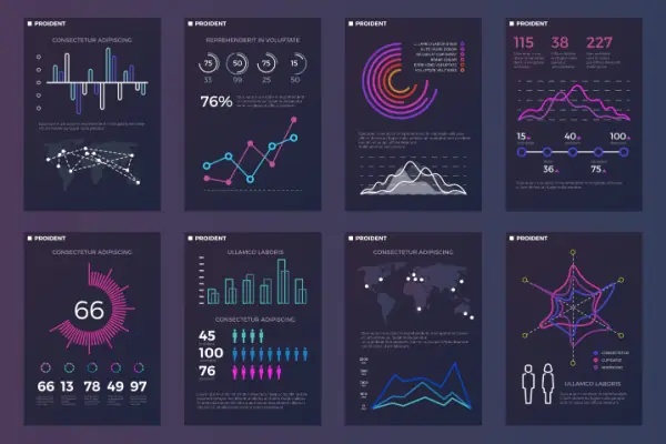
Data visualization is a powerful tool that turns complex data into easy-to-understand visuals. Different data visualization types are used to present various kinds of information. Let's explore some of these types, how they work, and where they are most effectively used.
A pie chart is a circular chart divided into slices to illustrate numerical proportions. Each slice represents a part of the whole, making it easy to compare different parts at a glance.
Pie charts are often used to show the breakdown of simple data points. They're great for visualizing market shares, survey results, or any data where you want to compare parts of a whole.
An area chart combines the line graph and fills the space beneath the line. This type of visualization emphasizes the magnitude of changes in data over time.
Area charts are used to display data over time, especially to highlight the total value across a trend. They are common in economics, weather data, and stock market trends.
A bubble chart displays three dimensions of data. Each point is a bubble, where its position and size represent different data points.
Bubble charts are useful for showing correlations in data in a visually engaging way. They're used in business, economics, and social sciences to compare and show relationships between data.
A Gantt chart is a type of bar chart that shows a project schedule. It illustrates the start and finish dates of the elements of a project.
Gantt charts are essential in project management. They help track different tasks, their progress, and how they overlap over time.
A funnel chart shows the progressive reduction of data as it passes from one phase to another. The shape of a funnel illustrates the flow and reduction at each stage.
Funnel charts are often used in sales and marketing to represent stages in a customer's journey, from initial contact to final sale.
A waterfall chart shows the cumulative effect of sequentially introduced positive or negative values. It's useful for understanding how an initial value is affected by subsequent changes.
Waterfall charts are used in financial analysis to show changes in revenue or profit over time. They help identify significant changes contributing to the final value.
A column chart uses vertical bars to represent data. Each bar's height or length varies according to its value.
Column charts are versatile chart types used in many fields. They are great for comparing different categories or showing changes in data over a period.
A line graph uses points connected by lines to show changes in data over time. It's effective in showing trends and progress.
Both the scientific and business worlds use line graphs frequently. They're ideal for tracking data over time, like stock market trends or temperature changes.
A bullet graph is a variation of a bar graph but is designed to address some of its limitations. It's used to display performance data against qualitative ranges.
Bullet graphs are often used in dashboards and presentations to show performance, like sales against targets or budget use.
A wedge stack graph is a circular graph with segments representing different categories. Each segment's size is proportional to its value.
This type of visualization is useful for showing hierarchical data or proportions within a whole, such as market segments.
A treemap is a type of data visualization that displays hierarchical data through nested rectangles. Each rectangle represents a branch of the hierarchy, with smaller rectangles inside it for sub-branches. The rectangles' sizes correspond to their values.
Treemaps efficiently visualize complex, hierarchical data in a limited space. They are excellent for showcasing large sets of hierarchical data like financial information, organizational charts, or product categories, helping viewers understand relative sizes and relationships easily.
A heat map is another data visualization tool that uses color variations to represent different values in data. It's particularly effective in showing patterns and concentrations in datasets across a two-dimensional surface.
Heat maps are widely used in various fields. In geography, they can show population density or temperature variations. In website analytics, they help understand user behavior, like where users click or how they scroll.
A dot distribution map uses dots to represent and visualize data geographically. Each dot stands for a certain number of occurrences, making it easy to see concentrations and patterns in the data.
If you want to represent groups of data according to the data's geographical distribution, this the map you'd need to use. It's useful in fields like demography to show population distributions, AND in public health to map disease.
A scatter plot displays values for typically two variables for a set of data. The data is displayed as a collection of points, with each point having the value of one variable determining the position on the horizontal axis and the value of the other variable determining the position on the vertical axis.
Scatter plots are important in statistics for identifying correlations, patterns, and trends between two variables. They are commonly used in scientific research, economics, and social sciences to analyze and interpret relationships in data.
A matrix is a grid-like structure used to show relationships between different sets of data. Each cell in the grid displays the interaction or relationship between the intersecting data points.
In business and research, matrices compare products, services, or other variables. They help in simplifying complex decision-making processes by providing a clear comparison of multiple factors or options.
A histogram is a bar graph that represents the distribution of numerical data. It groups data into bins or intervals and shows the frequency of data points within each bin.
Histograms are crucial in displaying the distribution of data, particularly when determining the shape of the data distribution, like normal, skewed, or bimodal. People that present statistics, research, and/or work in quality control processes, use histograms to show their findings.
A timeline is a graphical representation of events in chronological order. It's a linear representation that allows viewers to understand the sequence and timing of events.
Timelines are used in education, history, project management, and business planning. They help visualize the progression of events, project milestones, or historical timelines, making it easier to track progress and understand the sequence of activities. You can also use the Office Timeline Add-In in Microsoft to make timelines directly in PowerPoint.
Understanding these data visualization types and their applications enhances the importance of data visualization in different fields. Each type offers a unique perspective, making complex data more accessible and comprehensible. Whatever the purpose, all of these tools are essential in the world of data.

In summary, data visualization is a powerful tool that transforms complex data into clear, visual stories. Whether using charts, graphs, maps, or other methods, each type of data visualization serves a specific purpose. They simplify data, highlight trends, and bring clarity to the analysis. Understanding and applying the right data visualization types according to the data and the audience's needs can make a significant impact.
Are you looking to improve your presentations with effective and engaging data visualizations? Deck Sherpa is here to help! As the best presentation design agency in India, we specialize in incorporating various data visualization types into your presentations. Our experienced team skillfully handles the entire presentation design process, catering to organizations in various industries worldwide. Don't let complex data overwhelm your audience. Let us help you present your data in a way that is not only informative but also visually stunning. Contact Deck Sherpa today, and take the first step towards presentations that truly stand out! We can be reached at 1800 121 5955 (India), WhatsApp message us, send an email at contact@decksherpa.com, or through the Contact Form on our company website.
Share
Copy Url
Share
Copy Url
Share
Copy Url