 Share
Copy Url
Share
Copy Url

The color wheel is more than just a circle of colors—it’s a powerful tool that can transform any PowerPoint presentation. Choosing the right color palette is crucial in presentation design. It affects how your audience perceives your message, enhances readability, and ensures a professional look. Understanding color theory helps balance design elements, making slides visually engaging while following essential presentation design rules like the 5/5/5 rule, 10-20-30 rule, and 7x7 rule. A well-designed slide isn’t just about good content. It’s also about choosing colors that complement your message and brand. That’s where a PowerPoint specialist can help.
This article will explore how the color wheel plays a key role in presentation design. We’ll start with a quick overview of its structure and how it helps create harmony in slides. Next, we’ll explain how to use it effectively in presentations, ensuring colors work together instead of clashing. We’ll also highlight common color mistakes, like using too many shades or choosing low-contrast text and background combinations.
To help you make better color choices, we’ll share expert tips on selecting colors that align with your brand and message. Finally, we’ll explain why working with a professional presentation design agency or a PowerPoint specialist is a smart choice. It saves time, improves slide quality, and ensures your presentation looks polished and impactful. Let’s dive in and bring your slides to life with the right colors!
In presentation design, the color wheel is a vital tool that helps designers create visually appealing slides. It guides the selection of harmonious colors, enhancing clarity and audience engagement.
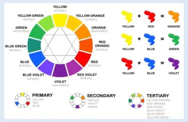
A color wheel is a circular diagram that shows the relationships between different colors. It includes primary, secondary, and tertiary colors, illustrating how they blend and interact. Designers use the color wheel to understand color theory and craft appealing color palettes.
Choosing the right colors in a presentation affects clarity, mood, and audience engagement. You can create the perfect color scheme by selecting appropriate primary, secondary, and tertiary colors. This enhances readability and ensures your message resonates effectively.
The color wheel can help identify complementary color combinations. These enhance the visual aspect of your slides. Applying these rules of color helps capture the audience's attention and improves message delivery.
Selecting the right colors is crucial for effective communication. Could partnering with a professional presentation design agency ensure your slides are both impactful and aligned with your brand?

In presentation design, the color wheel is a vital tool that helps designers create visually appealing slides. It guides the selection of harmonious colors, enhancing clarity and audience engagement.
The color wheel is a circular diagram illustrating relationships between colors. It comprises primary colors (red, blue, yellow), secondary colors (green, orange, purple), and tertiary colors, which are combinations of primary and secondary colors. Presentation designers use the color wheel to understand harmonies and craft appealing color palettes.
Primary colors are the foundation of all other colors. In the RGB model, these colors are red, green, and blue. They cannot be created by mixing colors, making them unique and crucial in color theory.
When you mix two primary colors, you get secondary colors. They are green (blue + yellow), orange (red + yellow), and purple (red + blue). They hold a middle ground in the color theory wheel, bridging the gap between primary and tertiary colors.
Tertiary colors are the result of combining a primary and a secondary color. This gives us six tertiary colors: red-orange, yellow-orange, yellow-green, blue-green, blue-violet, and red-violet. They add depth and nuance to the color theory wheel.
Colors are often categorized by temperature: warm and cool. Warm colors, like red and yellow, evoke energy and excitement, while cool colors, like blue and green, promote calmness and relaxation. Understanding these hues helps designers choose a color palette that influences audience perception and engagement. For instance, warm colors captivate the audience's attention, while cool colors create a soothing backdrop.
Color is a multifaceted phenomenon with several key characteristics that help us define and understand its nature. These characteristics are essential for artists, designers, and anyone working with it in any medium. The primary characteristics include:
Definition: Hue refers to the name of the color or the type of color we see, such as red, blue, yellow, etc.
Significance: It helps identify and categorize colors. Different hues evoke different feelings and reactions.
Definition: Value describes the lightness or darkness of a color. It can be adjusted by adding white to lighten (tint) or black to darken (shade) a hue.
Significance: Value is crucial for creating depth, mood, and visual interest in art and design. It's essential in creating contrasts and highlights.
Definition: Saturation defines the brilliance or dullness of a color. Color is in full saturation when it's pure and hasn't been muted or greyed by adding its complementary color.
Significance: It helps in describing the strength or weakness of a hue. Saturation can draw attention or give an understated look to a design or artwork.
Definition: Chroma measures the purity of a color or its difference from a neutral color (gray, white, or black). A color with high chroma has a vivid intensity, while one with low chroma appears more muted.
Significance: Chroma helps understand the difference between a color from its purest state and is used to differentiate between different levels of purity within a hue.
Definition: Colors are often described as "warm" or "cool." Warm ones remind us of heat and sunlight, like reds, oranges, and yellows. Cool colors evoke feelings of calm and coolness, like blues, greens, and purples.
Significance: Temperature can influence the mood of an artwork or design. Warm colors appear inviting and energetic, while cool colors may seem distant or calming.
Definition: Complementary colors sit opposite each other on the color wheel. For instance, red and green or blue and orange are complementary pairs.
Significance: They create strong contrasts, making each color appear brighter and more vivid.
Tint: A color mixed with white.
Tone: A color mixed with gray.
Shade: A color mixed with black.
Significance: By using tints, tones, and shades, artists and designers can expand a color's range, offering a broader palette to work with and more nuanced color choices.
Understanding these characteristics provides a solid foundation for working with color effectively, allowing one to manipulate and use it to evoke specific reactions, moods, or statements in their work.
The color wheel is essential in presentation design, offering numerous benefits that enhance visual appeal and communication. Here are ten reasons highlighting its importance:
Utilizing the color wheel allows designers to select harmonious color combinations, ensuring a cohesive and aesthetically pleasing presentation.
The color wheel aids in choosing effective color schemes, such as complementary or analogous palettes, enhancing the overall design.
By applying color theory principles from the color wheel, designers can create a clear visual hierarchy, guiding the audience's attention to key elements.
Selecting appropriate contrasting colors using the color wheel ensures text stands out against backgrounds, improving readability.
The color wheel assists in maintaining brand consistency by helping designers choose colors that align with brand guidelines.
Understanding the psychological effects of colors on the wheel enables designers to evoke desired emotions, enhancing audience engagement.
The color wheel helps you select culturally appropriate colors, avoiding potential misinterpretations.
Utilizing the color wheel to choose high-contrast color combinations ensures presentations are accessible to individuals with visual impairments.
The color wheel aids in maintaining a consistent aesthetic throughout the presentation, enhancing professionalism.
Exploring the color wheel inspires designers to experiment with various color combinations, fostering creativity in presentation design.
Incorporating the color wheel into presentation design enhances visual appeal and improves communication effectiveness.

Incorporating the color wheel into your presentation design can enhance visual appeal and audience engagement. Selecting harmonious color schemes ensures your slides are attractive and effective.
The color wheel is a tool that shows the relationships between colors, helping designers create balanced and appealing visuals. Understanding these relationships helps select color combinations that enhance your presentation's impact.
Analogous Colors
These are colors located next to each other on the color wheel, such as blue, blue-green, and green. Using analogous colors creates a smooth, unified look, making them ideal for topics that require a calm and cohesive feel.
Complementary Colors
These are colors opposite each other on the wheel, like red and green. Complementary color schemes offer high contrast, making elements stand out. This approach is effective for highlighting critical information or calls to action.
Triadic Colors
This scheme involves three colors evenly spaced around the wheel, such as red, yellow, and blue. Triadic color schemes provide a balanced yet vibrant look, suitable for engaging and dynamic presentations.
Monochromatic Colors
This approach uses varying shades, tints, and tones of a single color. Monochromatic schemes are clean and professional and therefore ideal for formal or minimalist presentations.
The choice of color scheme should align with the presentation's purpose and audience. For corporate decks, a monochromatic or analogous scheme ensures professionalism and cohesion. In contrast, creative pitches or an elevator pitch might benefit from triadic or complementary schemes to inject energy and capture attention. By thoughtfully applying color theory and utilizing the color wheel, you can craft a color palette for your project that resonates with your audience and enhances your message.

Colors play a significant role in influencing emotions and perceptions during presentations. Presenters can communicate their message clearly by using color harmony and applying color theory. This approach helps engage the audience effectively. Artists and designers use the spectrum of colors to create impact, ensuring every slide deck captures attention.
Blue is often associated with calmness, confidence, and reliability. Its soothing nature makes it ideal for corporate and financial presentations, fostering trust and professionalism. Many businesses use blue in their branding because of its credibility. Utilizing blue in your slide deck ensures a polished, professional look that builds confidence in your message.
Red is a vibrant color that evokes urgency and excitement. It’s commonly used in sales and marketing presentations to grab attention and drive action. This bold color stands out in complementary color schemes, especially those paired with neutral tones. Adding red strategically to slides can highlight critical points and encourage audience engagement.
Green symbolizes nature, growth, and sustainability. It’s widely used in ESG reports and investor pitch decks to reinforce messages of development and responsibility. Green represents balance and renewal. This makes it work well in four-color palettes for presentations emphasizing long-term progress.
Yellow exudes warmth, energy, and optimism. It’s an excellent choice for a startup or investor pitch deck, as it conveys enthusiasm and creativity. Since yellow naturally draws attention, it works well in high-energy presentations. Pairing it within the spectrum of colors ensures it enhances the visual flow without overwhelming the audience.
Presenters can captivate and persuade their audience by using color harmony and choosing shades that influence perception.

Selecting colors randomly in presentation design can lead to inconsistency and a lack of professionalism. A cohesive color scheme ensures visual harmony and reinforces your message.
Employing an excessive number of colors can create visual clutter, making slides overwhelming and distracting.
Insufficient contrast reduces readability, causing the audience to strain when reading the content.
Excessive use of bright colors can make slides appear unprofessional and can be harsh on the eyes.
Neglecting color contrast can make content difficult to read, especially for individuals with visual impairments.
By avoiding these common color mistakes, you can enhance the effectiveness and professionalism of your presentation design.
Choosing the right colors in a presentation is more than just looks. It affects clarity, engagement, and brand perception. Follow brand guidelines, use accent colors wisely, and guide attention with strategic color choices. Here’s how to use colors effectively for a polished and impactful presentation.
Maintaining brand consistency is crucial in presentations. Make sure your slides match your brand’s identity by following guidelines and using corporate colors. Use the Slide Master feature in PowerPoint to keep brand elements consistent on all slides.
Choosing the right accent colors enhances key points without overwhelming the audience. Implementing the 60-30-10 rule—using 60% primary color, 30% secondary color, and 10% accent color—creates a balanced and engaging color scheme.
Strategic use of color directs focus to essential information. Employing distinct colors to highlight critical elements, such as call-to-action buttons or important data points, effectively guides the audience's attention.
Consider collaborating with professional presentation design services for a polished and impactful presentation. PowerPoint specialists can ensure your slides align with brand standards and effectively communicate your message.

Designing an effective presentation involves more than just assembling content. It requires strategic color selection to enhance clarity and engagement. However, DIY color choices often lead to subjectivity, inconsistency, and a lack of cohesive strategy.
Selecting colors without professional guidance can result in mismatched palettes, causing visual discomfort and diminishing the presentation's impact. For instance, combining colors across the warm/cool boundary can lead to visual fatigue and discomfort.
Outsourcing to expert presentation designers ensures a cohesive, engaging, and visually appealing presentation. These professionals apply color psychology and align designs with your brand identity, enhancing audience engagement and reinforcing your message. This approach not only saves time but also elevates the overall quality of your presentations.
By collaborating with professional presentation design services, you can overcome the pitfalls of DIY design and achieve polished, impactful presentations that resonate with your audience.

Choosing the right colors can make or break a presentation. The color wheel helps create balanced, engaging slides that capture attention and reinforce key messages. But expert color selection goes beyond just picking shades that look good. It ensures consistency, readability, and brand alignment, making your presentations more polished and effective.
At Deck Sherpa, we specialize in designing presentations that look visually stunning and drive impact. Our team applies professional presentation design services to craft slides that use color psychology, brand consistency, and strategic contrast. Whether you need a sales deck, investor pitch deck, or corporate presentation, we help bring your ideas to life with expert color selection.
Don’t leave your presentation’s success to chance. Outsource presentation design to industry experts who know how to make every slide work for you. Call 1800 121 5955 (India), write to us at contact@decksherpa.com, or WhatsApp us for a consultation. Alternatively, fill out the Contact Form on our website with your project details.
🚀 Check out our Showcase to see how we’ve worked with multinational organizations: Deck Sherpa Showcase
📌 Explore our Services for more clarity: Deck Sherpa Services
Let’s create presentations that make a lasting impact!
Share
Copy Url
Share
Copy Url
Share
Copy Url