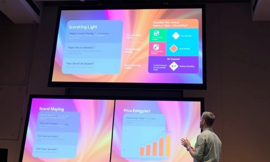
Pitch deck design sits at the heart of every startup story. Done right, it turns a simple concept into a journey that even the busiest potential investors will follow from slide one to the last question. A strong pitch deck presentation is more than pretty pictures; it is a sharp presentation design that guides the eye and the mind. Each of the ten or so slides must move the audience from the raw spark of a business idea to a clear path for fundraising.
First, show the market pain. Then, in one breath, reveal your product or service. Next, back that promise with a lean business plan and numbers that feel real. Make the value proposition pop with bold icons, short copy, and one compelling chart. Above all, aim to impress investors without drowning them in data.
A professional pitch deck keeps the fonts tidy, the colors on brand, and the pace brisk. It holds only the facts that matter and nothing that slows the reading flow. Nail those basics, and you have the bones of a winning pitch. With thoughtful pitch deck design guiding your story, reaching the next milestone can feel less like a gamble and more like the natural next step.

Pitch deck design is more than pretty slides; it decides who gets the cheque. Smart founders, therefore, turn to professional pitch deck services. These teams build customized pitch decks that grab cash fast while rivals wait.
Nearly half of new startups close because funding never arrives on time. That gap strands a great business idea before it can grow. A crisp deck gives investors a quick, clear map of where the money will go and why it will return.
Speed matters, too. Data from thousands of deals shows investors decide in about one minute and 56 seconds whether to read on or click away. In that blink, impactful investor pitch decks must guide eyes across slides and lock the story in place. Treat each deck like a movie trailer—short, sharp, and impossible to skip.
Strong visuals keep attention. Clean data charts turn numbers into signals, not noise. Consistent templates, professional fonts, and tight graphics polish every point. If time is short, call in specialists to handle layout and design. These touches show how your product fixes pain and backs a rock‑solid value proposition.
When everything clicks, you impress investors fast. Thoughtful pitch deck design cuts doubt and sparks conversation. The result is quicker term sheets and a smoother path to your next funding milestone.

Great pitch deck design changes loose facts into a clear journey that money can follow. Add professional pitch deck services, and the flow beats most PowerPoint presentations. You then move closer to a term sheet before the coffee even cools.
First, order matters. A tidy slide path—Problem, Solution, Market, Traction, Ask—keeps reading effortless. Smart PPT design guides the eye, sets the pace, and avoids back‑tracking. A structure like this is what seasoned VCs expect to see.
Open with the pain. Prove it hurts real users and dents revenue. Tie the struggle to everyday product and service gaps. Show why now is the moment to fix it, not next year.
Reveal the cure in one breath. Highlight your tech, workflow, or model. Make the value proposition pop through a simple graphic. End with a line that hints at defensibility.
Size the prize. Point to potential clients, total spend, and growth rate. Keep numbers sourced and current. Show you know who buys first and why they stick around.
Showcase proof: paying users, repeat orders, or pilot wins. Use charts, not paragraphs. Hard data here tells investors the engine already runs.
State the amount, the runway it buys, and how each rupee fuels growth. Frame it as a fundraising presentation that finishes the loop from story to scale.
Every slide must answer “What’s next?” This straight-to-the-point rhythm is the core purpose of a pitch deck. If you need presentation designers, hire them—clarity pays.
Craft this compelling pitch, keep slides tidy, and you’ll prove why pitch deck design earns trust long before due diligence begins.

Pitch deck design shines when storytelling in presentations and hard stats move together. Story grabs the heart, and numbers seal the deal. This guide bridges a slick corporate presentation and a nimble startup pitch deck. It maps a clear, data‑driven flow that any founder can use with easy PowerPoint templates and a bit of flair. Investors look for eight key slides: cover, problem, solution, market, traction, team, model, and ask. This order answers all their big questions.
Start with clear branding. Add a punchy tagline. Close with one plain‑English line that shows your value. This slide frames everything that follows and shows instant attention to design that sets you apart in a crowded inbox.
Describe the pain your target market feels today. Use one brief stat and a short customer quote so readers see real frustration, not theory. Finish by hinting that relief is coming next.
Show how you fix the problem with one strong image. Layer a few keywords so viewers get your point across without squinting. Emphasise speed, ease, or cost—whichever wins fastest.
Prove the opportunity is worth the bet. Combine TAM, SAM, and SOM bars so potential investors or partners see scale and focus. Cite an external source and date for trust.
Show how money moves—map who pays, how often, and at what margin. Tie the flows back to a lean business plan so no one wonders where revenue hides.
Highlight proof—users, MRR, or pilots—that beats mere projections. Data here builds trust faster than adjectives. Connect milestones to past spend to show capital efficiency.
Introduce the crew that can execute. Pair each face with one sharp win or domain skill. This snapshot tells why you— not someone else—should run with the idea.
State how much you seek, what runway it buys, and key spend buckets. This clarity helps investors decide in seconds if the request fits their thesis.
Master this blueprint, and your pitch deck design will do what it should—help investors see value quickly and move your round forward.

Pitch deck design turns blank slides into venture fuel. When every visual choice feels thought‑through, you glide from a rough idea to a successful pitch before the coffee cools. Below are nine easy principles that lift any deck from decent to irresistible—without drowning readers in jargon.
Show one thought per slide. Surround it with generous white space so brains rest and key points shine. Viewers process faster and remember more—science backs it.
Pick a primary hue, two accents, and stick to a single headline‑body font combo. Consistency beats loudness and works across PowerPoint presentation styles and themes.
Swap heavy text for icons, charts, or photos. Visual cues keep investors and partners engaged and cut reading time in half.
Use bold, oversized figures to highlight traction. Eyes jump to the metric that matters and grasp your plan to make money in seconds.
Place your logo, colours, and voice on each slide. This cohesion helps tailor your pitch to audiences that value trust and recall.
Craft titles that fit two lines max and push the plot forward. Clear headers turn a deck into a guided tour, not a guessing game.
Keep body text near 40 pt for live rooms. Large fonts cut strain and make data pop on distant screens during pitch presentations.
Mix text and images evenly. This blend boosts retention across different types of presentations and stops slides from feeling like textbooks.
Trim extras ruthlessly. A tidy layout lets every pitch flow, helping PowerPoint templates breathe and ideas land fast.
Master these rules of pitch deck design, and your deck will not only look sharp—it will also win the nods that move funding talks forward.

A pitch deck is a great window into your venture. It must explain how your business fixes real pain so investors to understand the upside fast. Deck Sherpa’s pros slash build time by 60 percent through professional graphic design and tight workflows.
By handing off the heavy lifting, founders stay on product and pipeline. Our number‑driven process maps each slide to investor questions and ships files in days, not weeks.
Our studio offers content polish, custom graphics, interactive roadshow decks, template makeovers, and full end‑to‑end builds.
The result is a compelling pitch deck built to captivate from cover to cover. This pitch deck showcases numbers, vision, and brand cues in equal measure, giving back precious hours for calls and demos.
Ready to move faster? Ask for a deck audit or book a discovery call today. Reach us on the India toll‑free line 1800 121 5955, ping WhatsApp, email contact@decksherpa.com, or drop your details in the Contact Form. One short chat turns rough slides into winning stories—because when every second counts, the right partner makes all the difference.