 Share
Copy Url
Share
Copy Url

In the realm of presentation design, nothing clarifies complex data quite like charts and graphs. They are not only visual aids but powerful tools that can illuminate patterns, trends, and relationships in data, making them digestible for your audience. Especially in a sales pitch deck, where every second counts, utilizing the right chart can be the difference between engagement and confusion. But it's not just about using a chart; it's about choosing the right one. There's a plethora of chart types available in PowerPoint, each suited to specific data types and storytelling methods. This article delves into the myriad benefits of harnessing charts in presentations, breaks down the different types perfect for a sales pitch, and offers tips on their effective deployment. Dive in to ensure that the next time you present, your data speaks, compellingly, and persuasively.
Presenting data in a sales pitch deck often deals with complex figures, growth metrics, and future projections. Narrating this information verbally or through text can lose the attention of your audience. Charts and graphs act as a translator, converting intricate data into easily comprehensible visual forms. By using these tools, you break down barriers of complexity, allowing the audience to quickly grasp the core message. The visualization ensures that even those not well-versed in data analysis can capture the essence of your presentation, leading to the successful communication of key points.
A sales pitch deck's success often hinges on the clear presentation of pivotal insights. Using tables or long paragraphs to represent this can dilute the importance of these insights. In contrast, a well-designed graph or chart effectively shines a spotlight on significant trends and figures. It acts as a visual cue, directing the viewer's attention to the crucial data points that form the backbone of your sales argument. By providing an instant visual summary, you ensure your audience recognizes and remembers the most compelling aspects of your pitch.
Every second counts when delivering a sales pitch deck. Audience attention spans can be short, and bombarding them with too much text or unstructured data can be counterproductive. Charts come to the rescue by representing volumes of data succinctly. They encapsulate information in a manner that is both rapid to convey and easy for the audience to assimilate. By reducing the time spent on explaining data verbally, you can maintain a smooth flow in your presentation, ensuring sustained engagement from start to finish.
The power of visual storytelling in a sales pitch deck is unparalleled. A striking chart or graph does more than just represent data – it tells a story, paints a picture, and invokes emotion. By showcasing facts and figures visually, you make them more impactful and memorable. This ensures that the essence of your pitch lingers in the minds of your audience long after the presentation ends. The lasting impression not only solidifies your case but significantly enhances the potential of swaying your audience in favor of your proposal.
The design and layout of a sales pitch deck speak volumes about the presenter's professionalism. Incorporating charts and graphs signals meticulous preparation and a thorough understanding of the subject. It showcases a commitment to clarity and the audience's understanding. Additionally, a well-designed, error-free chart lends an aesthetic appeal, further boosting the overall impression of your presentation. When stakeholders observe this level of professionalism, they are naturally more inclined to trust the information presented and are more likely to be influenced by your data-driven arguments.
A crucial aspect of many sales pitch decks is showcasing comparisons – be it competitor analysis, market share, or year-over-year growth. Simple textual representation can often leave the audience perplexed, attempting to mentally juxtapose figures. However, with the apt use of bar graphs, pie charts, or line graphs, these comparisons become crystal clear. Visual aids allow immediate juxtaposition of key metrics, ensuring that the audience not only sees the difference but comprehends the magnitude and importance of it. In essence, charts transform potentially convoluted comparisons into clear, compelling narratives, enhancing the weight of your sales arguments.
Every audience is different, and so is every sales pitch deck presentation. There may be instances where you need to pivot your presentation based on audience reactions or emerging discussions. Charts and graphs provide flexibility in storytelling. With a well-structured visual aid, you can swiftly move between points, emphasize different aspects, or even delve deeper into specific data, all while maintaining audience engagement. This adaptive nature ensures that your sales pitch remains dynamic, relevant, and responsive to the room's pulse, maximizing the potential for a successful outcome.
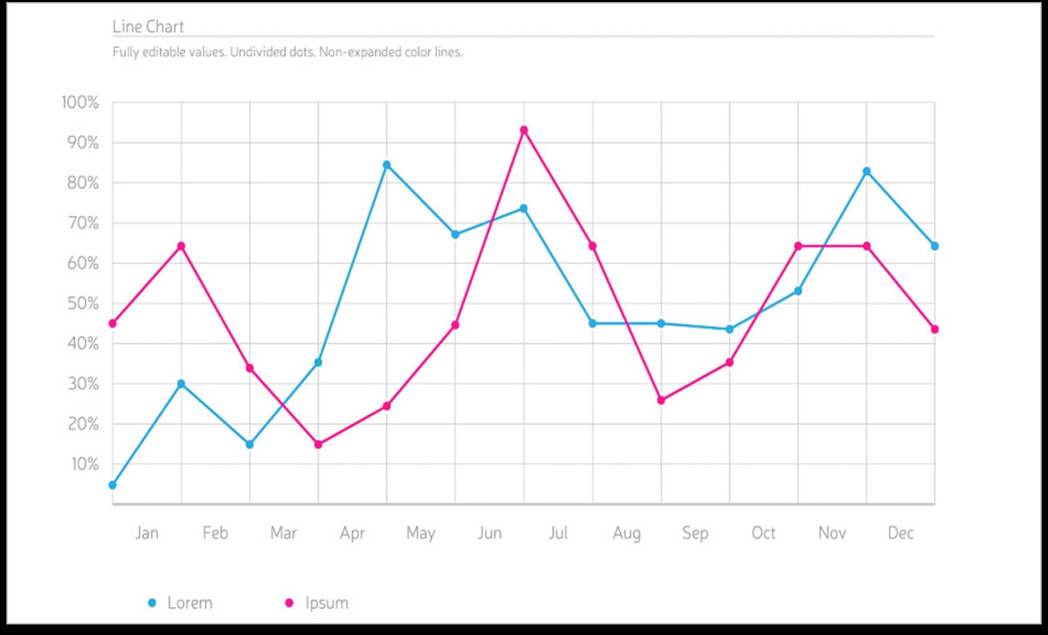
Line charts are a great inclusion in a sales presentation. They are a great help when it comes to analyzing multiple data sets or trends, over a long period. The continuous data range is plotted on the Y-axis, and the variable range, which is usually time or duration, is over the X-axis. Simple to use and minimalistic in style, there are some ways to make these more noticeable and attractive.
A line chart is great to use when you need to show continuous data over several years. It can help you depict data performance in a neat and organized manner, for a specific period as well. Examples of places where you can use a line chart in a sales pitch deck are:
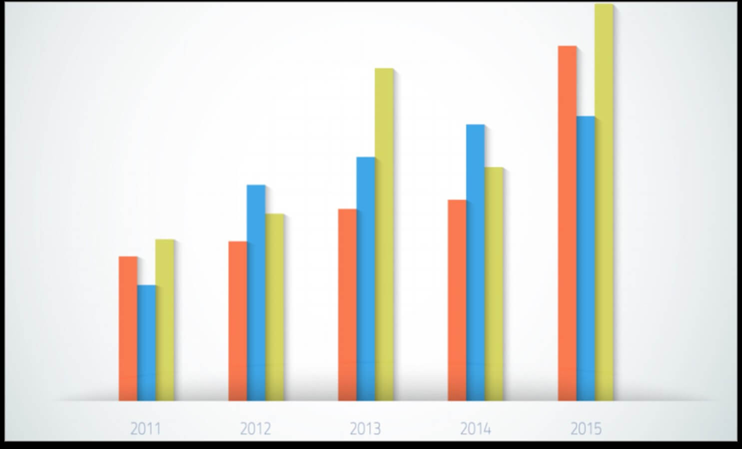
Want or need to present a comparison of data between two or more value sets? The best and easiest way to do this is to create a bar chart in your sales presentation. This chart has two axes, with numerical values on the horizontal axis and the category sets on the vertical axis. If you plot the bars vertically, it becomes a column chart instead. There are a few ways in which you can use a bar chart, in your presentation, to engage your audience.
There are so many examples of where and when you should use a bar chart to present data:
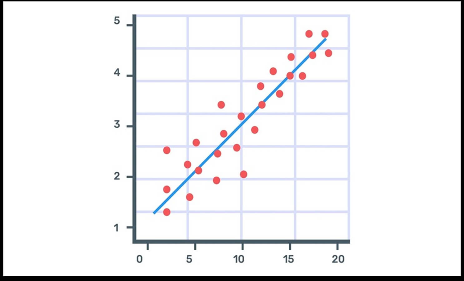
The scatter plot is another excellent chart used to show the relationship between two data series and determine their correlation. The dots on the graph show how the data intersect and how it correlates, on the X and Y axes. PowerPoint designers use this kind of chart to indicate data distribution trends and identify deviations. Here’s how to create a scatter plot chart that’s neat and engaging.
Scatter plot dots show the values of individual data points along with trends when the data is used as a whole. Scatter plot charts are often used in:
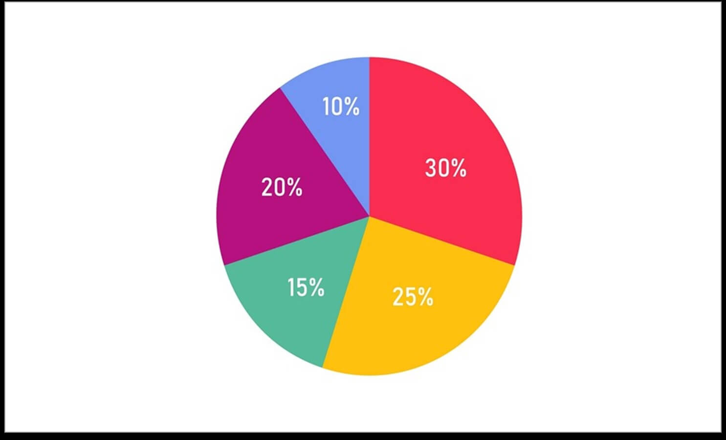
A pie chart is an excellent way to show the composition of data as a whole. It’s best depicted through the use of percentages to break down an entire data set. Here are some things to remember when creating a pie chart in a presentation.
Pie charts are very commonly used in sales pitch decks. They can be used to depict different types of data sets such as:
We've picked the simplest ones to work with but there are plenty more types you can choose to use in your sales pitch deck or any other presentation. Check them out in this compelling article from Hubspot that's titled 16 Best Types of Charts and Graphs for Data Visualization [+ Guide].
Charts are a great way to present your data. They are neat, can be made attractive, and offer a break from chunks and blocks of textual information that are likely to bore your audience. At Deck Sherpa, we know how to work with charts to bring your data to life and keep your audience engaged from start to finish. Check out our work on our website. We’re confident that you’ll like what we’ve done. To book an appointment with us, call us at 1800 121 5955 (India), or even WhatsApp, to speak to someone from the team or send us an email at contact@decksherpa.com.
Share
Copy Url
Share
Copy Url
Share
Copy Url